


Leer más +
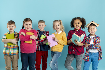
Educación Parvularia
La Educación Parvularia es el nivel educativo que atiende integralmente a niños desde su nacimiento hasta su ingreso a la educación básica, sin constituir antecedente obligatorio para ésta.
Leer más +
Ed.Gral. Básica 1º Ciclo
Enseñanza General Básica.Primer ciclo básico (1º a 4º básico). Enfasis de Este Nivel: Enseñar lectoescritura mediante método Matte en combinación con método Hispanoamericano e integral, metodología constructivista, combinada con conductista y sociocognitivista, talleres de comprensión lectora y escritura creativa...

Leer más +
Ed. Gral. Básica 2º Ciclo
Enseñanza General Básica. Segundo ciclo básico (5º a 8º básico). Énfasis de Este Nivel, profundización en comprensión lectora, desarrollando estrategias de lectura que permitan aplicación de habilidades superiores como: síntesis, análisis, inferencia, extracción de información explicita e implícita, vocabulario activo y argumentación...

Leer más+
Educación Media
La Educación Media es el nivel educacional que atiende a la población escolar que haya finalizado el nivel de educación básica y tiene por finalidad procurar que cada alumno expanda y profundice su formación general y desarrolle los conocimientos, habilidades y actitudes que le permitan ejercer una ciudadanía activa e integrarse a la sociedad,
DIARIO MURAL
INFORMACIÓN GENERAL. PERÍODO ESCOLAR
Información general que apoya al desarrollo del proceso escolar de su pupilo.
 LISTA DE UTILES
Obtenga la lista de Útiles de cada curso 2026.
 HORARIOS
Información nuevos horarios 2024.
 APODERADOS
Horario de profesores para atención de Apoderados.
 UNIFORME
Uniforme Escolar.
 CIRCULARES
Circulares informativas, manuales, reglamentos.
 REUNIONES
Reuniones de Apoderados, programación 2025.
 PRUEBAS
Calendario de Pruebas 2026.
Últimas Noticias
Leer +
08 Enero 2026 by Super User, in BLOGRECONOCIMIENTO BUEN DESEMPEÑO PRUEBA PAES GENERACIÓN 2025

Leer +
09 Octubre 2025 by Super User, in BLOGAlfredo Ugarte, el Bichólogo, nos visita!!

Leer +
17 Junio 2024 by Super User, in BLOGCuadro de Honor - Talentos Musicales

Leer +
04 Junio 2024 by Super User, in BLOGCuadro de Honor - Talentos Artísticos


Button Designs
- Publicado: Jueves, 21 Marzo 2013 08:39
- Visto: 1426
Default buttons
Button styles can be applied to anything with the .btn class applied. However, typically you'll want to apply these to only <a> and <button> elements for the best rendering.
| Button | class="" | Description |
|---|---|---|
btn |
Standard gray button with gradient | |
btn btn-primary |
Provides extra visual weight and identifies the primary action in a set of buttons | |
btn btn-info |
Used as an alternative to the default styles | |
btn btn-success |
Indicates a successful or positive action | |
btn btn-warning |
Indicates caution should be taken with this action | |
btn btn-danger |
Indicates a dangerous or potentially negative action | |
btn btn-inverse |
Alternate dark gray button, not tied to a semantic action or use | |
btn btn-link |
Deemphasize a button by making it look like a link while maintaining button behavior |
Cross browser compatibility
IE9 doesn't crop background gradients on rounded corners, so we remove it. Related, IE9 jankifies disabled button elements, rendering text gray with a nasty text-shadow that we cannot fix.
BUTTONS SHORTCODES
[btn size="" type="" class="" class="" disabled="" link="" target="" icon="" icontheme=""][/btn]
type: primary / info / success / warning / danger / inverse / link / flat
size: primary / large / small / mini
disabled: yes / no
icon: add the icon type without the " icon- "
icontheme: white / black
[btn size="" type="" class="" class="" disabled="" link="" target="" icon="" icontheme=""][/btn]Button sizes
Fancy larger or smaller buttons? Add .btn-large, .btn-small, or .btn-mini for additional sizes.
<p>
  <button class="btn btn-large btn-primary" type="button">Large button</button>
  <button class="btn btn-large" type="button">Large button</button>
</p>
<p>
  <button class="btn btn-primary" type="button">Default button</button>
  <button class="btn" type="button">Default button</button>
</p>
<p>
  <button class="btn btn-small btn-primary" type="button">Small button</button>
  <button class="btn btn-small" type="button">Small button</button>
</p>
<p>
  <button class="btn btn-mini btn-primary" type="button">Mini button</button>
  <button class="btn btn-mini" type="button">Mini button</button>
</p>
Create block level buttons—those that span the full width of a parent— by adding .btn-block.
<button class="btn btn-large btn-block btn-primary" type="button">Block level button</button>
<button class="btn btn-large btn-block" type="button">Block level button</button>
Disabled state
Make buttons look unclickable by fading them back 50%.
Anchor element
Add the .disabled class to <a> buttons.
<a href="#" class="btn btn-large btn-primary disabled">Primary link</a>
<a href="#" class="btn btn-large disabled">Link</a>
Heads up! We use .disabled as a utility class here, similar to the common .active class, so no prefix is required. Also, this class is only for aesthetic; you must use custom JavaScript to disable links here.
Button element
Add the disabled attribute to <button> buttons.
<button type="button" class="btn btn-large btn-primary disabled" disabled="disabled">Primary button</button>
<button type="button" class="btn btn-large" disabled>Button</button>
One class, multiple tags
Use the .btn class on an <a>, <button>, or <input> element.
<a class="btn" href="/web2/">Link</a>
<button class="btn" type="submit">Button</button>
<input class="btn" type="button" value="Input">
<input class="btn" type="submit" value="Submit">
As a best practice, try to match the element for your context to ensure matching cross-browser rendering. If you have an input, use an <input type="submit"> for your button.
SOCIAL ICONS
<ul class="social-icons fixclear">
 <li class="social-twitter"><a href="#">Twitter</a></li>
 <li class="social-dribbble"><a href="#">Dribbble</a></li>
 <li class="social-facebook"><a href="#">Facebook</a></li>
 ...
</ul>
SOCIAL ICONS - Colored
<ul class="social-icons colored fixclear">
 <li class="social-twitter"><a href="#">Twitter</a></li>
 ...
</ul>
SOCIAL ICONS - Colored only on :hover
<ul class="social-icons coloredHov fixclear">
  <li class="social-twitter"><a href="#">Twitter</a></li>
 ...
</ul>
or Shortcode:
type: normal / colored
[socialicons class="" type="" style="" ]
 [socialicon network="" url="#"]
[/socialicons]
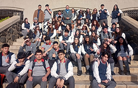
Bienvenidos a American College
Desde 1980, año de su fundación, nuestro establecimiento ha sido dirigido por la Srta. Helia Chávez Gómez, maestra que ha entregado lo mejor de sí, para abrir nuevas posibilidades de desarrollo a los niños de Villa Alemana. Nuestro colegio ha consolidado la Jornada Escolar Completa.